


These are the final designs I created for Malenka Originals (a paints and furniture shop in Westboro, Ottawa, ON).
Client Brainstorming
I’d like to walk through the process, compromises, and revisions to illustrate my process. There were two ads I was asked to produce by my client:
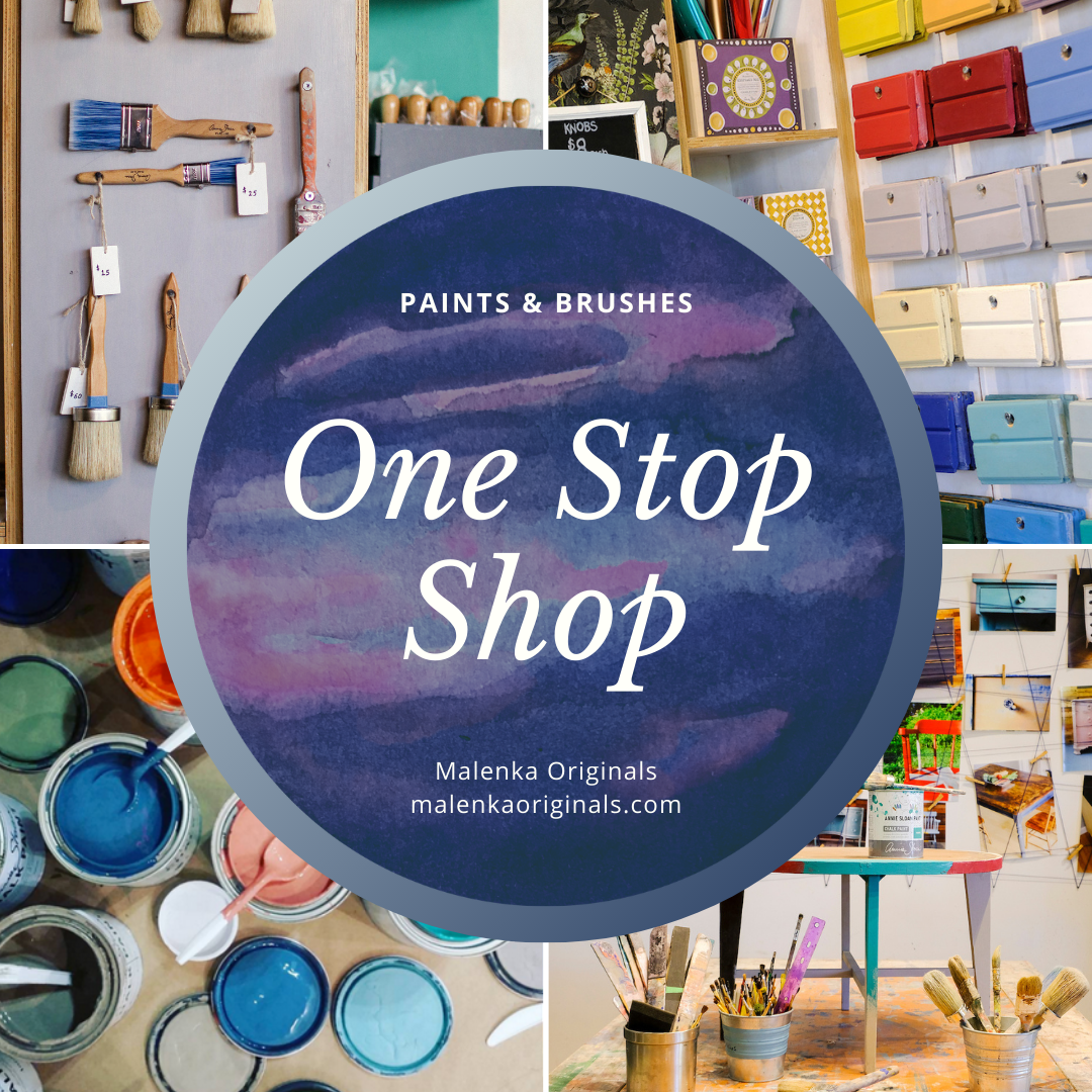
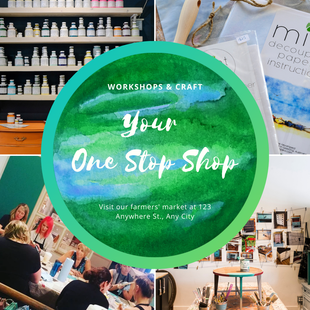
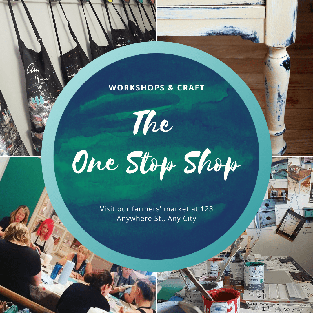
- A series of ad images advertising the full inventory of her shop with the intention to present it as a “one stop shop for furniture upcycling”
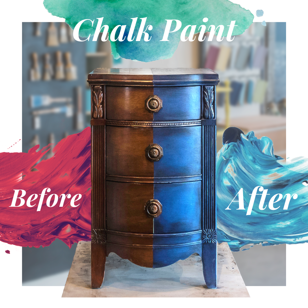
- A single Ad image promoting her “Chalk Paints” showing how “paints transform old furniture”
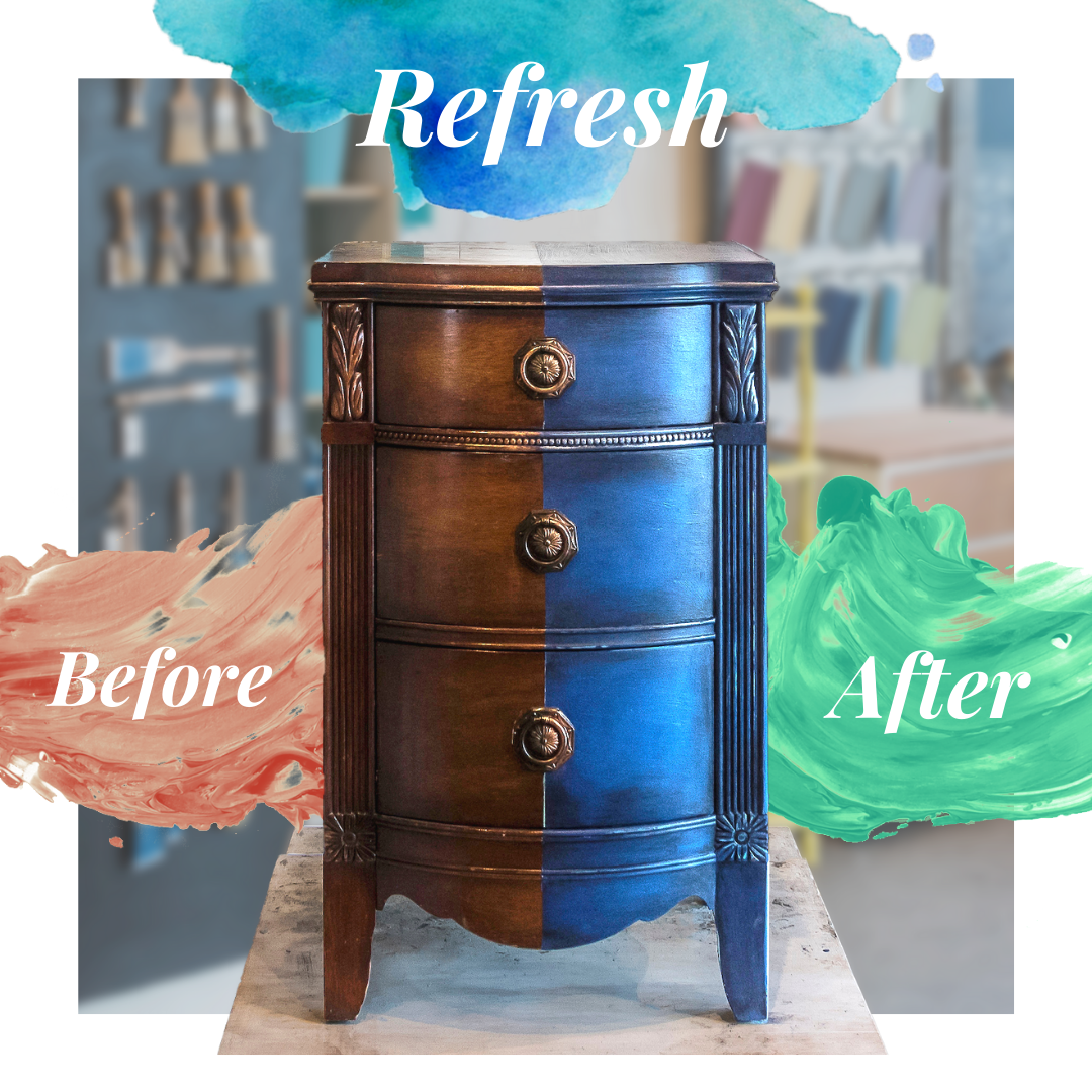
So I got to work creating some drafts as I was short on time, but during the opening meeting I described the layouts and composition. The layout for the Chalk Paint Ad would be featuring a painted furniture piece showing a before and after with basic text that expresses the idea of transformation. The layout for the One Stop Shop Ads would be a mosaic of images showing the three main varieties of products our client sold as well as some supporting central text.
First Draft
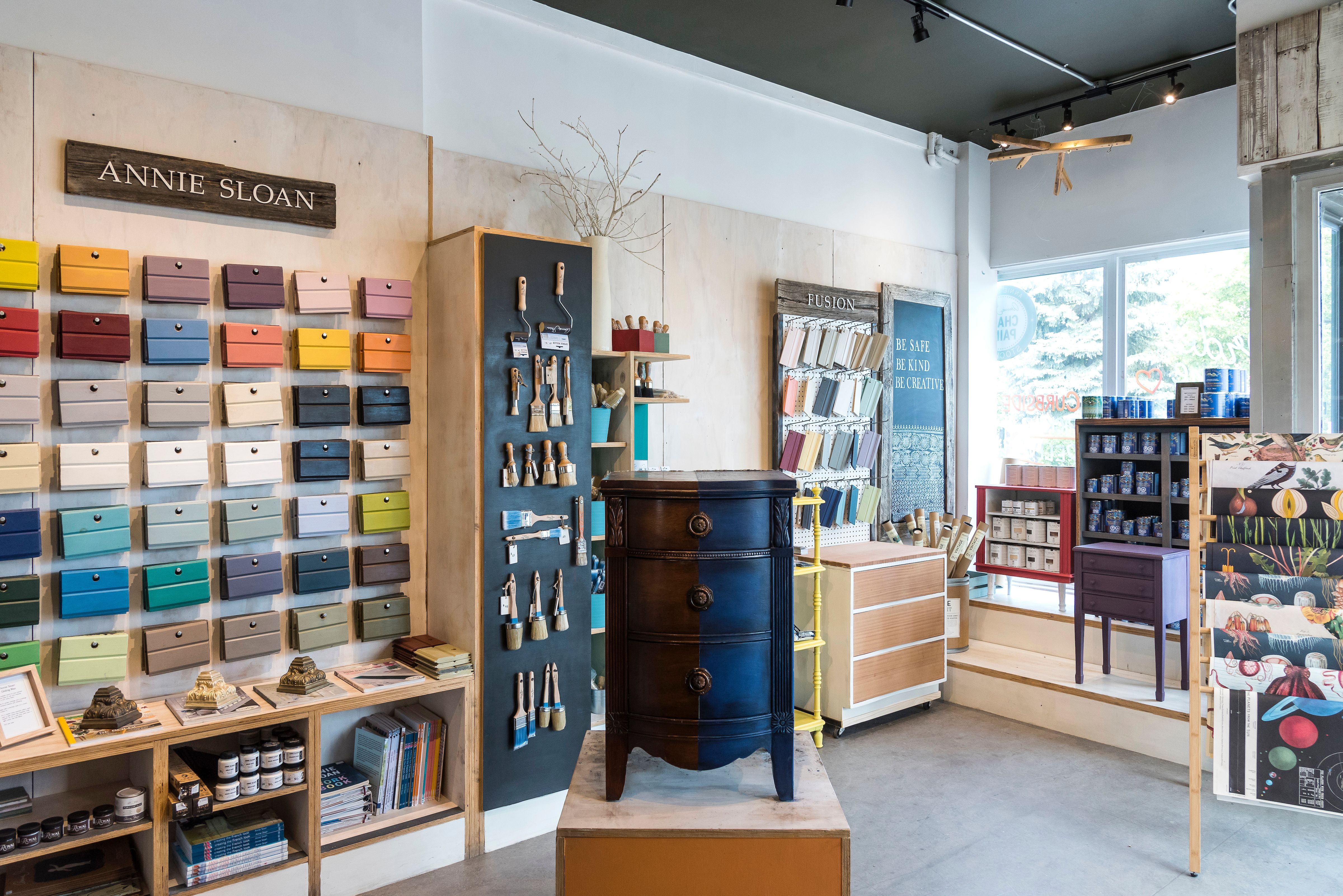
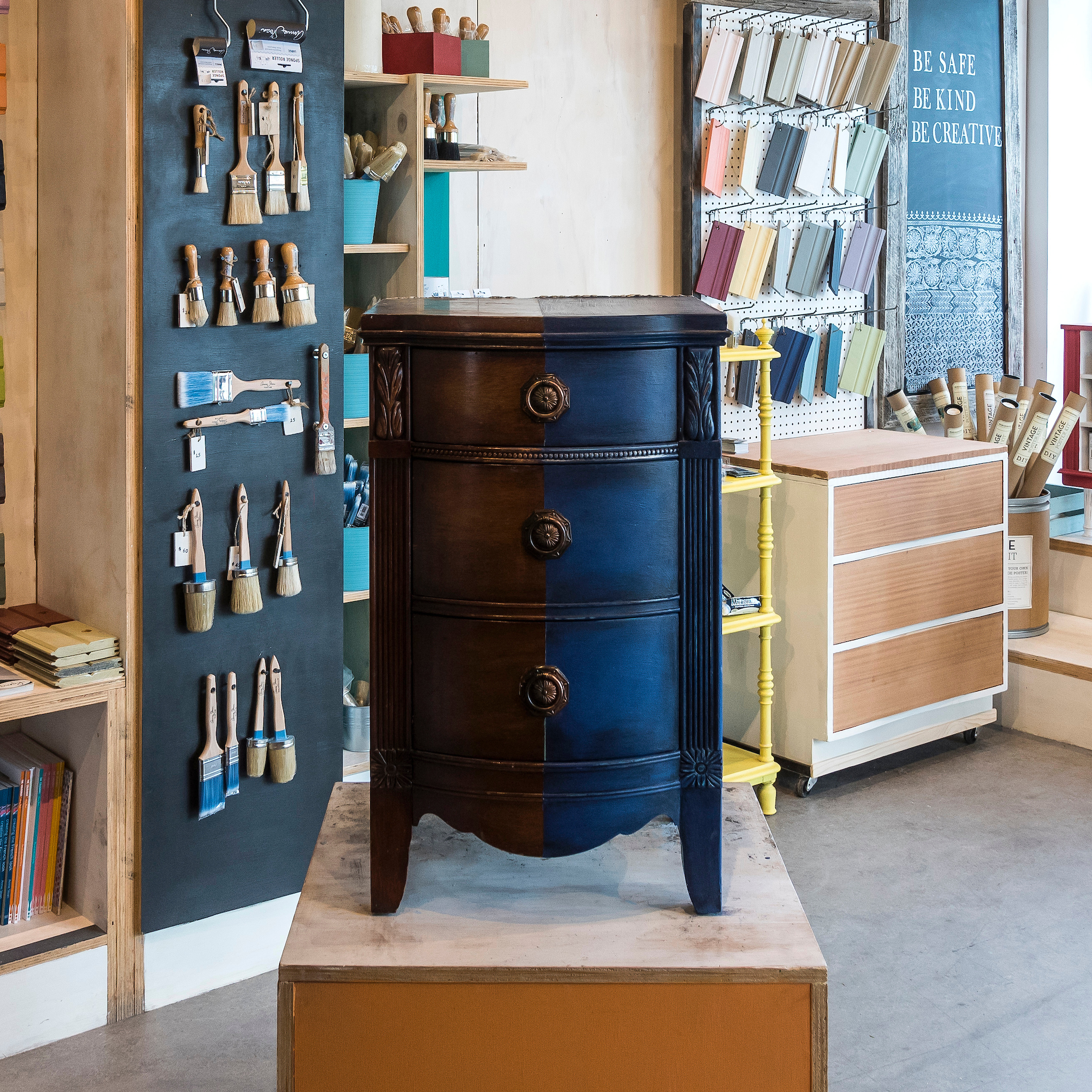
So I got to work with the photos I was provided for some inspiration, and I found the perfect piece for a half/half split piece of furniture for a before/after type Ad!
So first I took the photo and improved it’s lighting so that the subject (the piece) looked a bit more appealing and easier to read it’s details at a distance.

Once I’d isolated the image I got to work with the layout I’d thought up and did some work to make the piece stand out more in the Ad. The first draft for it I came up with looked like this:
As for the One Stop Shop Ads I already had a layout in mind and just quickly threw together some assets with no finalized text.


Second Draft
At our second meeting where I presented the designs my client requested I keep to a softer pastel oriented palette so I made some modifications to the colours on all the ads. She also asked for some image swaps for the product categories, slight sizing changes and that the text for the Chalk Paint Ad say “refresh” or “refurbish”. So having made those changes I sent them over email for a final draft.


Third Draft
I got some feedback from the second draft asking that for the One Stop Shop I change the fonts to something more serifed and “classic”, as well as to change around some images and finalize the text. After that this was the final result that went up on facebook Ads:


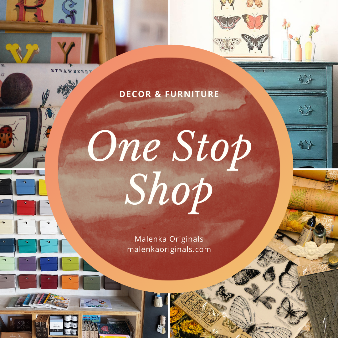
These Ads were finalized in Canva with all the assets I created usable for future material by the client. And I created templates she could change them in the future because she really enjoyed the format of the One Stop Shop Ads.
