
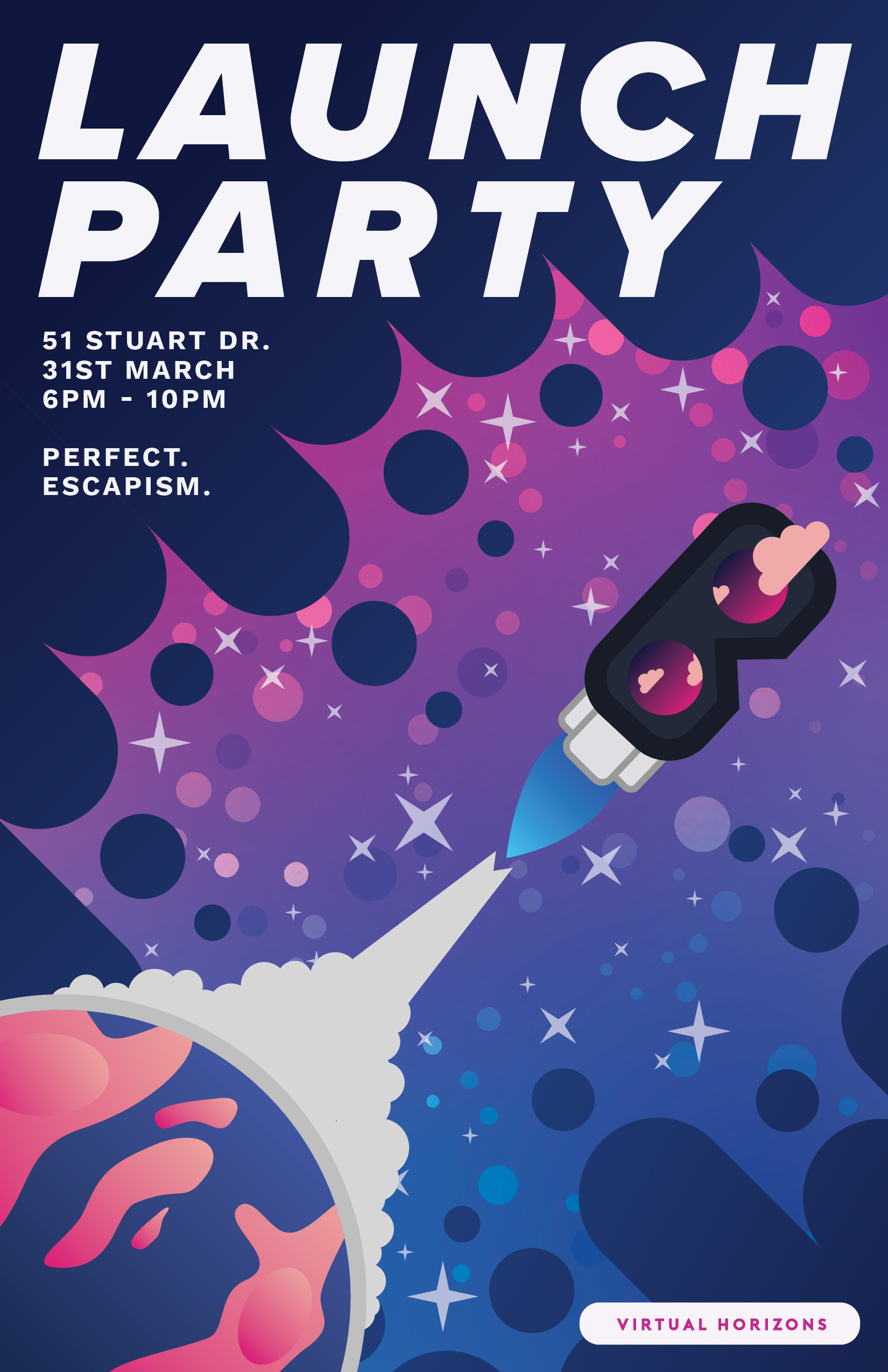
This is a poster I created based on some branding I put together for a fake company I came up with!
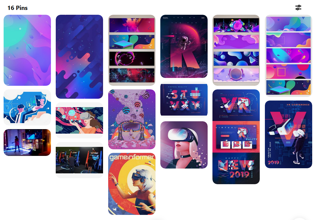
I started with a moodboard, because honestly how else will you grasp that style you’re looking for?
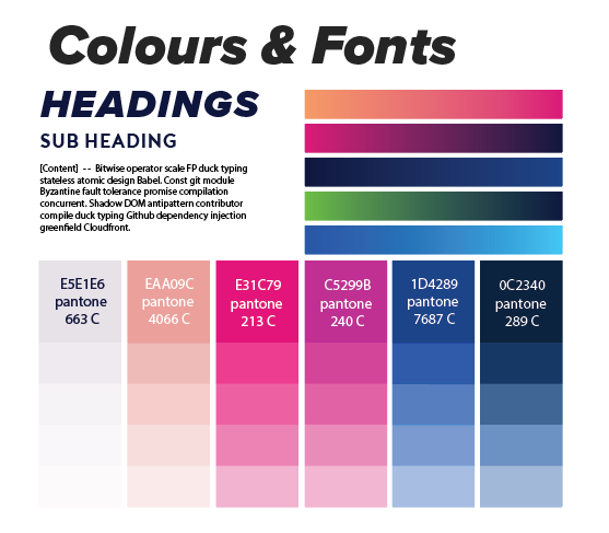
After this I came up with what kinds of words I’d associate this business with. In this case they were:
- Escape
- New Horizons
- Leading Edge
- Future
- Arcade
- Light
I feel that logos are really import, if you can nail down the finite super-atomic small sized concept of a brand. The rest springs forth pretty easily! So I started to put together a logo. I created a couple different versions using the icons of the VR headset, horizon lines, gradients, clouds, and rockets. But eventually this is what I settled on.
